
July 9, 2025
If you’ve ever stared at your website thinking, “I know this needs to look better, but I have no idea where to get free professional images for my website…” – you are so not alone.
In this post, I’ll walk you through exactly how to choose images for your site that actually reflect the energy of your work. We will be using stock photo sites (because let’s be honest, they can be a lifesaver when you can’t hire another photographer), but I’ll show you how to use them strategically, so you’re not just grabbing whatever looks “fine”. The goal is to build a small, purposeful image library that makes your whole website feel more aligned, more professional, and (duh) more beautiful.
I’ll walk you through:
- The types of photos every wellness site actually needs
- How to search smart on stock sites (no endless scrolling!)
- Tools and systems to keep your image library tidy and powerful
- Strategic placement so your site feels cohesive and welcoming
My hope is that, by the end, you’ll feel confident building a small but mighty photo library that actually reflects your brand.
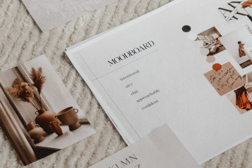
Step 1: Clarify the feeling you want to create
Before you start searching for images, it’s important to get clear on one thing:
What do you want your website to feel like?
I’ve you’ve ever come across someone’s website that looks good, feels good, feels intentional, or just right, chances are it’s not because of the fancy layout or the colors alone. It was the style and energy behind the visuals. The photos weren’t random, they were chosen to match the tone of the work being offered.
That’s what we’re aiming for here. You don’t want to be just filling space with something pretty, you want to choose images that reflect the emotional tone of your practice.
So start by asking yourself:
- What kind of energy do I want my site to have?
- How do I want someone to feel when they visit it (even before reading a single word)?
- If my website were a physical space, what would it feel like to walk in?
- What kind of energy do I hold for my clients?
Write down a few words that capture the feeling. These will become your north star for choosing visuals.
A few examples:
Grounded, soft, nurturing
Clean, calm, clear
Natural, open, welcoming
Every image you choose from here on out should reflect these words. That way, instead of choosing what looks trendy or popular, you’ll be building a library that actually feels like you and your business.
Step 2: Get clear on what types of images you actually need
Now that you have a sense of the energy you want your website to hold, let’s talk about what kinds of images actually help to create that.
You don’t need a whole ton, but you do want to be intentional about the ones you do use. The goal is to create a consistent visual tone that supports your message and helps people feel something when they land on your site.
Let’s walk through a few key types of images to include in your site’s photo library – whether you’re building your first site or just refreshing your existing one.
Photos of you
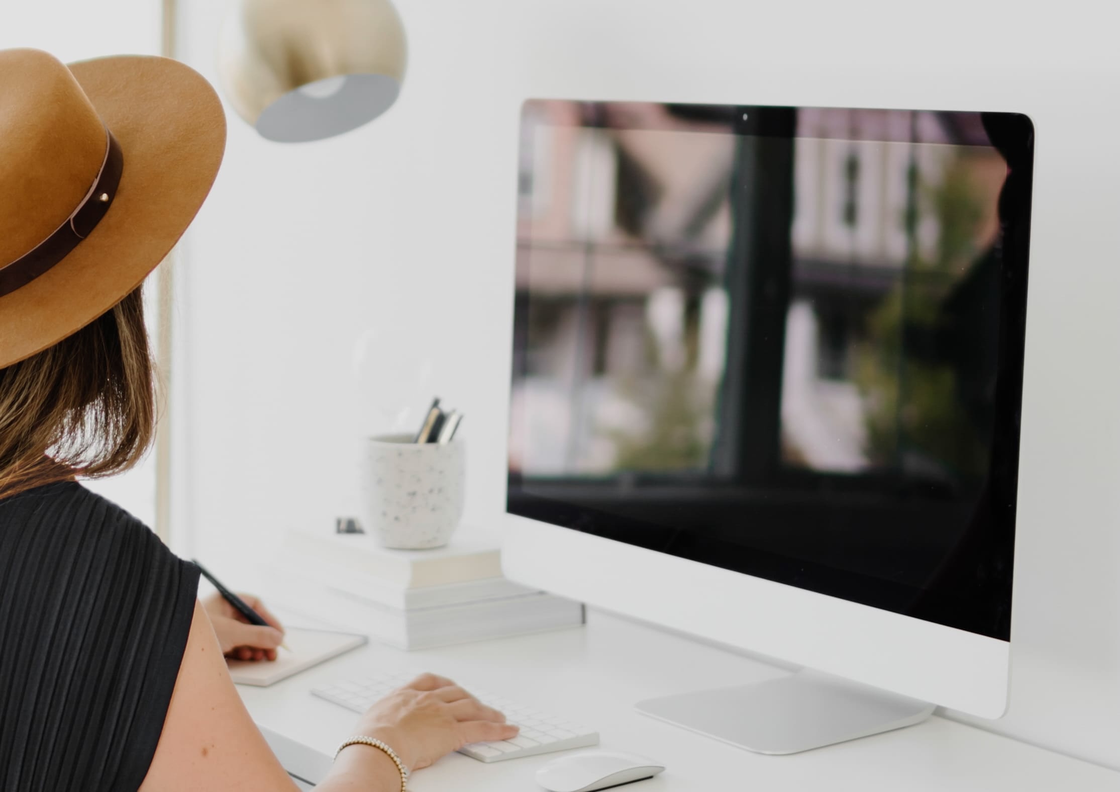
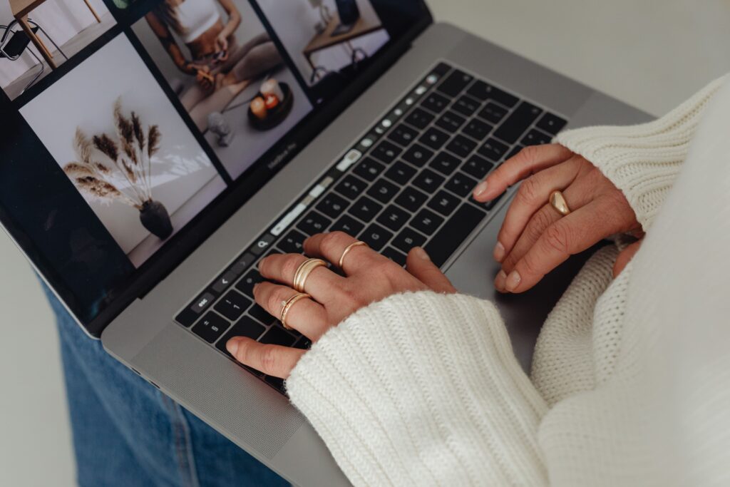
This is your #1 priority. People connect with people. And if you’re a solo wellness provider, you are the brand.
These should be professionally taken photos – not selfies, not quick shots from your phone. The quality, the composition, and energy of professional photography makes a huge difference. It shows your clients that you care about presentation and it creates an immediate sense of trust.
You want:
- A clear, natural headshot (ideally smiling 😊)
- Lifestyle shots of you in your space doing what you do or simply being in your element (even if it’s in your living room!)
- Movement-based photos like your hands in action, lighting a candle, setting up your space, prepping for a session, etc.
- The one people always forget: horizontal images that can be used in wide banner-style sections across your site
You want a variety of different angles, dimensions, compositions, and focal points. This is where working with a photographer really helps. They’ll guide you to get a mix of close-up and pulled-back shots, portrait and landscape orientation, and a few with intentional “white space” (open areas that allow for text overlay). You don’t need 100 photos, even just 10-20 solid ones can be enough.
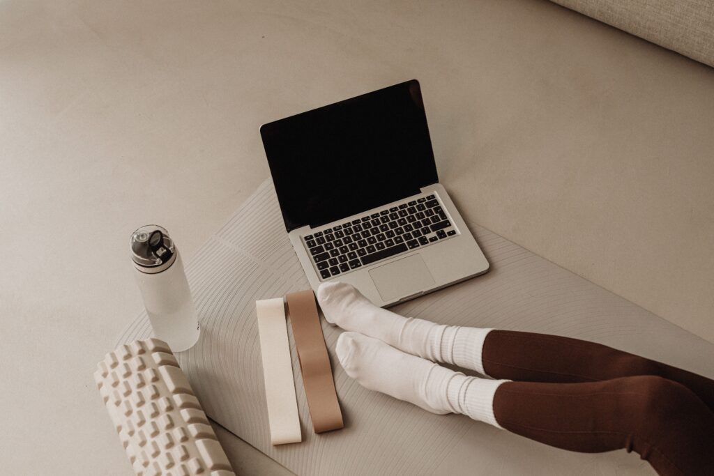
Photos of objects & tools in your practice
Your space and tools tell part of your story, and they help build familiarity with your work. They add depth and detail that make your work feel tangible, grounded, and real – especially to someone experiencing it online for the first time.
You might include:
- A flat lay of your favorite tools: bowls, oils, journal, tarot cards, whatever you actually use
- A shot of your mat and cushion
- Herbal tinctures, notebooks, essential oils
- A cozy tea setup or calming corner of your space
- Close-ups of hands in motion: pouring, holding, adjusting, writing…
These kinds of photos create sensory cues and emotional anchors – things that help people imagine themselves working with you.
Stock photos that match your brand energy
Stock photos can be useful when chosen intentionally. But not all stock is created equal.
You’ll learn more about how to choose stock images in the next section, but here’s the main rule:
Only use stock images that match the emotional and visual tone of your work.
If it feels generic, overly polished, staged, or like something you’ve seen 100 times already… skip it.
Instead, look for:
- Consistent lighting and tone. Whether your brand is bold and vibrant or soft and calming, look for images that match that mood. Bright colors? Go for photos with rich tones and contrast. More earthy and grounded? Choose softer, natural light.
- Intentional simplicity. You don’t want a photo that has too much going on. Look for clean compositions where the subject is clear. This make it easier to layer text on top (when needed) or use the image as a subtle design element.
- Photos with negative space. Negative space means there’s some empty or open area in the photo (like a plain wall, tabletop, or corner of a room). These kinds of images are perfect for banner sections or areas where text needs to sit over the photo.
- Top-down or close-up object shots. These are gold for wellness sites. Think: a top-down image of a journal and tea cup, or a close-up of hands holding a bowl, a tincture bottle, or placing yoga blocks on a mat.
TL;DR: Choose images that feel like they belong in your brand’s world—whether that’s colorful, neutral, cozy, minimal, or expressive. They need to support the experience you want to create.
Step 3: Find free professional stock images that support your brand
Stock images are meant to fill in the visual gaps that your own photos don’t cover. That might mean background textures, cozy object shots, or simple visuals that help break up a long section of text.
That said, it’s important to know that every photo on your website should have a purpose. It’s either guiding someone’s attention, reinforcing a message, or creating an emotional cue that helps your visitor feel something.
This step is about navigating stock libraries with a clear filter: choosing only the images that align with the tone, energy, and intention you’ve already clarified. They’re there to support the message you’re already communicating – not just to fill up space.
Here are some of my favorite stock libraries:
- Pexels → A well-loved free library with a wide range of modern, natural-looking images.
- Kaboompics → A free, highly curated site with soft, warm tones, styled workspaces, and interior imagery. Great for background visuals and grounded, minimal scenes.
- Dupe → A free collection created for online biz owners and creatives. Some images lean more personal and IG-ready, but you can definitely find some gems for your website.
- Unsplash → One of the largest free libraries out there, with everything from minimalist object shots to nature and wellness scenes. Some premium (paid) images are mixed in, but plenty of quality freebies if you’re willing to dig.
- Lummi → Free AI-generated images made by creators who are tired of boring, overused stock photos. While I usually prefer real photography, this one stands out for its creativity, diversity, and modern abstract options – great for added depth and detail like abstract shapes and background elements.
- Elevae → Paid editorial-style photo and video bundles. High-end feel with soft lighting, lots of negative space, and a grounded earthy aesthetic.
- Haute Stock → Paid, wellness-aligned imagery with a clean, feminine feel. Known for their intentional, serene styling and easy-to-use bundles that include video content too.
- Styled Stock Society → Paid membership with cohesive and inclusive photo collections and ready-to-use Canva templates. Everything’s designed to work together, which makes branding across platforms super easy.
- Olivia Atkinson → Paid access to soulful, slow-living imagery made for heart-led brands. Think natural light, real textures, and intentional styling.
- Death to Stock → Paid membership with bold, artistic visuals that don’t look like typical stock photos. Ideal if you want something more raw, expressive, and creatively distinct.
How to search smarter on stock photo sites and find what you need
I have literally spent hoooourrssss on stock photo sites when I don’t have a clear direction, so I know how overwhelming it can be when you don’t know what to look for.
Here’s how to avoid the scroll-hole and actually find images that work:
- Start with the emotion or energy you want to communicate. Instead of searching for something literal like “yoga” or “wellness”, start with feeling-based keywords like “slow morning light,” “warm and nurturing,” “soft power”. Your search term doesn’t always have to be specific. Sometimes something totally unexpected (like a window, fabric, or shadow) can evoke the exact feeling you’re going for, even if it’s not what you had in mind.
- Add helpful context words when you need something specific. If you are looking for a particular kind of image, layer in terms that narrow it down without closing off creative options or getting too literal. Like “flat lay” for top down object shots or “neutral background” if you want something simple and non-distracting.
- Filter by orientation. It’s always helpful to think about where the images will be used on your site. Need a homepage banner? Filter for horizontal or landscape images. Want to layer text over the image? Look for photos with negative space.
- (My favorite) Browse the creator’s profile to find more images that match. On sites like Pexels and Unsplash, once you find a photo you love, click the creator’s name! You’ll often find a whole collection of images with the same lighting, tone, and editing style. It’s an easy way to find a mini-collection of cohesive visuals without jumping between totally different styles or photographers.
Step 4: Organize and compress your images
You’re going to thank yourself later for this step.
Once you’ve gathered your images (headshots, tool shots, and stock), it’s time to organize them. Trust me, saving your photos in your Downloads folder and calling it a day leads to total chaos when it’s time to actually use them.
Here’s how you can organize your images:
- Create a main folder called something like Website Images. Inside that folder, create subfolders like Headshots & Portraits, In-Action & Lifestyle Shots, Tools & Details, and Backgrounds & Textures. This way, you’re never digging through a mess of images wondering “where the heck did that journal flat lay go?!”
- Rename your image files. This is sooo important for SEO. Instead of uploading something called IMG_2938.jpg, rename it with descriptive keywords that reflect the image and your content. (I talk allll about SEO in this blog post for beginners.) Use dashes *not underscores or spaces*, keep it relevant to the image and always try to include a keyword if you can like “yoga-teacher-lighting-candle” or “yoga-mat-breathwork-session”. Search engines and screen readers actually read these filenames, so it helps both your visibility and your accessibility.
- Compress your photos before using them. Large, uncompressed images slow down your website, which can hurt both your SEO and your user experience. That means longer load times, frustrated visitors, and even lower rankings in Google search. Imagine someone visiting your homepage and waiting 10 seconds for your main image to load… see ya later!
How to compress your images
Compressing your images just means making the file size smaller without changing how they look. It helps your site load faster, which makes it feel smoother and more professional.
Here’s how to do it:
- Go to a website like iLoveIMG or TinyPNG (there’s lots more out there but I use these 2 a lot)
- Drag and drop your images into the site
- Let it do its magic (it takes seconds)
- Download the compressed versions and upload those to your website. I usually create a separate folder called something like “Compressed” so I know which ones to use on my site.
✨ Bonus tip: Try to keep each image under 300-500KB when possible, especially for banner images or photos at the top of your pages. These are the first things people (and Google) load, so if they’re too large, your site can feel sluggish or unresponsive. If you use one of the tools I shared above and your picture still comes out over 500KB, you can always try shrinking the photo down using a tool like iLoveIMG’s Resize Tool. Smaller dimensions = smaller file size.
Step 5: Use your images strategically across your site
Alright, you’ve got your image library, now let’s put it to work!
Remember, every photo on your site should have a purpose. It’s either guiding someone’s attention, reinforcing a message, or creating an emotional cue.
This step is about placement: knowing where to put different types of photos so your site flows naturally, feels cohesive, and draws people deeper into your work.
Here’s how to think about where each type of image belongs:
- Banner or hero sections → Use wide, horizontal images here – ideally something spacious, with breathing room or negative space for text overlays. This is your first impression area, so pick something that sets the emotional tone of your work.
- About page or “meet you” sections → Use a clear, friendly photo of you (duh!) People connect best when they can see the human behind the work.
- Services or offer sections → Pleeease skip the awkward stock photo of a “client” shaking hands. Instead, choose detail shots that match the energy of the service: your tools, you/your hands in action, your space, or objects that symbolize the work (e.g. a meditation cushion, your studio, your office, etc.)
- Content-heavy pages or blog posts → Break up long sections of text with images that add visual rhythm and reinforce the message. Use background images, soft textures, or top-down lifestyle shots that relate to the theme of the post.
- Contact, booking, or final CTA sections → This is a great place to bring in another photo of you, or something that represents warmth, invitation, or openness. You want people to feel like it’s safe (and simple) to reach out.
Want support?
If you’re still feeling a little stuck or you’d rather not do all this on your own, I can help.
I’m a web designer who works specifically with wellness professionals and I offer both image curation sessions and full website design packages. Whether you just need help choosing stock images that actually feel aligned, or you’re ready to refresh your site with strategy and soul – I’ve got you. Click here to reach out.
—
Note: Some links on this page are affiliate links, so I may earn a small commission if you purchase through them (at no extra cost to you). Sometimes, you’ll get a discount or special bonus for using them.
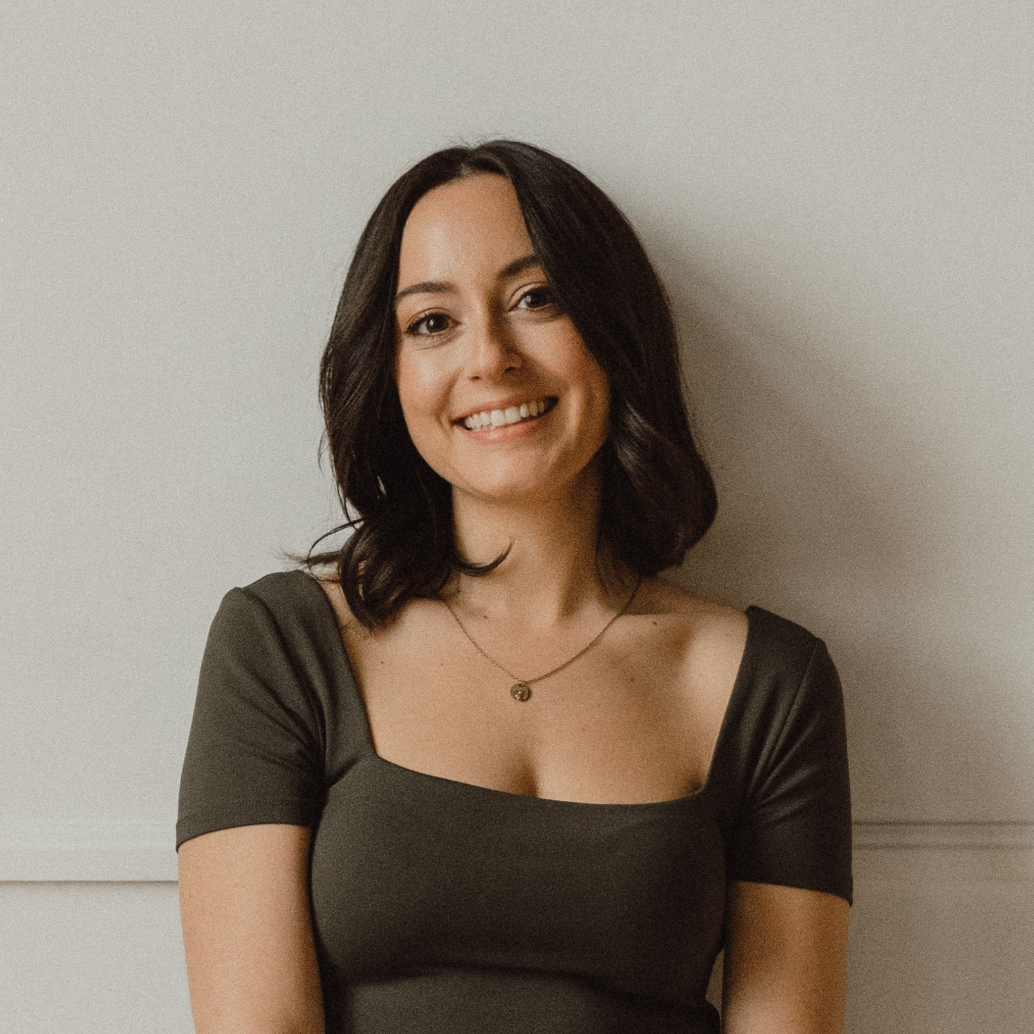
Vickie is the founder of VERVE & COLOR, a creative studio crafting elevated, intentional websites for health and wellness brands. She’s spent over a decade studying and practicing wellness—from holistic nutrition and meditation to sound therapy and somatic healing—alongside a career designing digital experiences for global companies. Today, she blends both worlds to create websites that are not only beautiful and easy to use, but rooted in the heart of the work her clients do.
