November 15, 2025
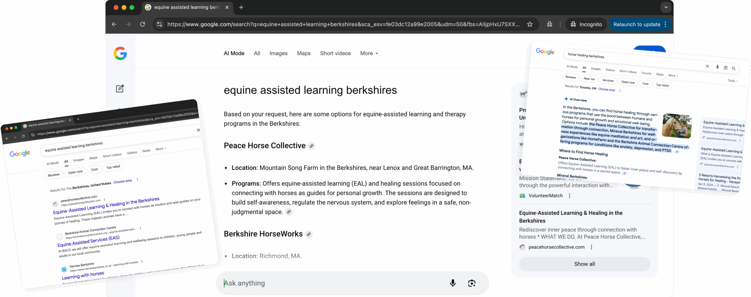
Summary: This case study breaks down how VERVE & COLOR designed and optimized a Showit website for Peace Horse Collective, an equine-assisted learning practice in the Berkshires. We focused on clear messaging, simple page structure, dedicated FAQs, and strong on-page SEO to help the site rank #1 on Google and appear in the AI Overview within weeks of launch.
The Vision
When we started this project, Peace Horse Collective didn’t have a website or visual identity yet – just a general sense of the kind of work its founder, Leiko, wanted to bring forward.
Peace Horse Collective is a wellness brand centered on equine-assisted learning (EAL): a hands-on, non-riding experience with horses to help you navigate challenges and support personal growth.
Leiko’s sessions offer something people rarely find in traditional wellness spaces: time with a horse in a quiet, natural environment where they feel supported, seen, and listened to. It’s simple, connection-based work that happens on the ground next to the horse, and not through riding. For most people, this is brand-new territory, so the website needed to make this easy to understand, without being overwhelming or stripping away the simplicity that makes the sessions so powerful.
In our early conversations, Leiko talked about wanting a brand that felt soft, respectful, and closely tied to the natural environment she works in. She preferred a color palette without bright hues, and a look that felt approachable and elegant. She also wanted the site to be straightforward with minimal text, clear paths, and strong visuals that showed the majestic presence of horses without feeling cheesy or overdone.
So the goal became creating a calm, welcoming online space that reflects what her sessions feel like in person: honest connection, room to breathe, and support that meets each person where they are. Everything from the brand direction to the website structure was shaped with this in mind, so visitors could understand the work clearly and feel the same sense of ease they’d experience at the barn.
The Challenge
Because Peace Horse Collective was brand new, we were starting with a blank foundation. Leiko knew the experience she wanted to offer in person, but translating that into a brand and website that someone could understand in just a few seconds was the biggest challenge. Equine-assisted learning is powerful, but it’s unfamiliar for most people, and she didn’t want the long, text-heavy explanations that are common on EAL websites today.
Her audience is open-minded and curious, but they’re also coming in with very little context. The website needed to explain the work clearly, feel inviting, and help people know exactly where to go next, and be structured in a way that Google and AI could understand so that people looking for this kind of work could actually find her.
Her main priorities were:
- Help people understand what working with a horse actually looks like, especially since her sessions happen on the ground and are different from riding, therapy, or coaching
- Keep the information concise, avoiding the long, wordy explanations she saw on most competitor sites
- Create a space that feels safe and welcoming, reflecting the calm, supportive experience clients have when they’re with the horses
- Show the beauty and presence of the horses in an elevated way, without slipping into cheesy imagery
- Make the website easy to move through with a clean flow, clear pages, and simple next steps
As a website designer for health and wellness brands, my job was to bring these priorities to life and create an online experience that mirrors what her sessions offer in person – clear, warm, and easy for visitors to step into.
“I didn’t know where to begin. I needed handholding and a clear process, and Vickie helped me turn vague concepts and feelings into reality. She made me feel seen and heard and understood.”
Leiko, Founder of Peace Horse Collective
The Approach
We started by getting clear on the feeling she wanted people to experience the moment they landed on her site. To help with that, I walked her through a short vision exercise at the beginning of the project. She described standing in a quiet pasture surrounded by wildflowers, late-afternoon light, horses resting nearby, and the kind of stillness you only get in nature. That description ended up influencing the entire brand direction – from the warm neutrals and minimal, spacious layouts to the subtle floral details woven throughout the site.
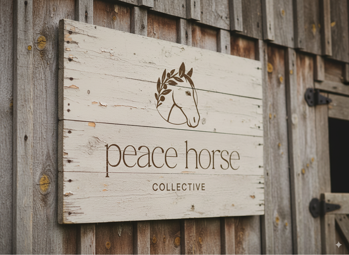
Once we had that feeling in mind, we moved into the branding, where the logo quickly became the most meaningful part of the identity. I absolutely love how layered it is. On the surface, it feels clean and understated, but there’s so much symbolism built into it. The horse’s gentle downward gaze, the protective circle, and the olive branch each represent something essential to her work: trust, peace, and healing. Even the letterforms play a role – their shape and stance echo the strength and stability of a horse, which adds another subtle layer of meaning you only catch if you’re really looking.
For the wordmark, we added a small olive branch inside the “o” to carry that same sense of connection into simpler applications. I just love how the overall identity feels intentional, refined, and deeply connected to her work.
Next, with the brand identity in place, we moved into the website and focused on bringing that same feeling into the online experience.
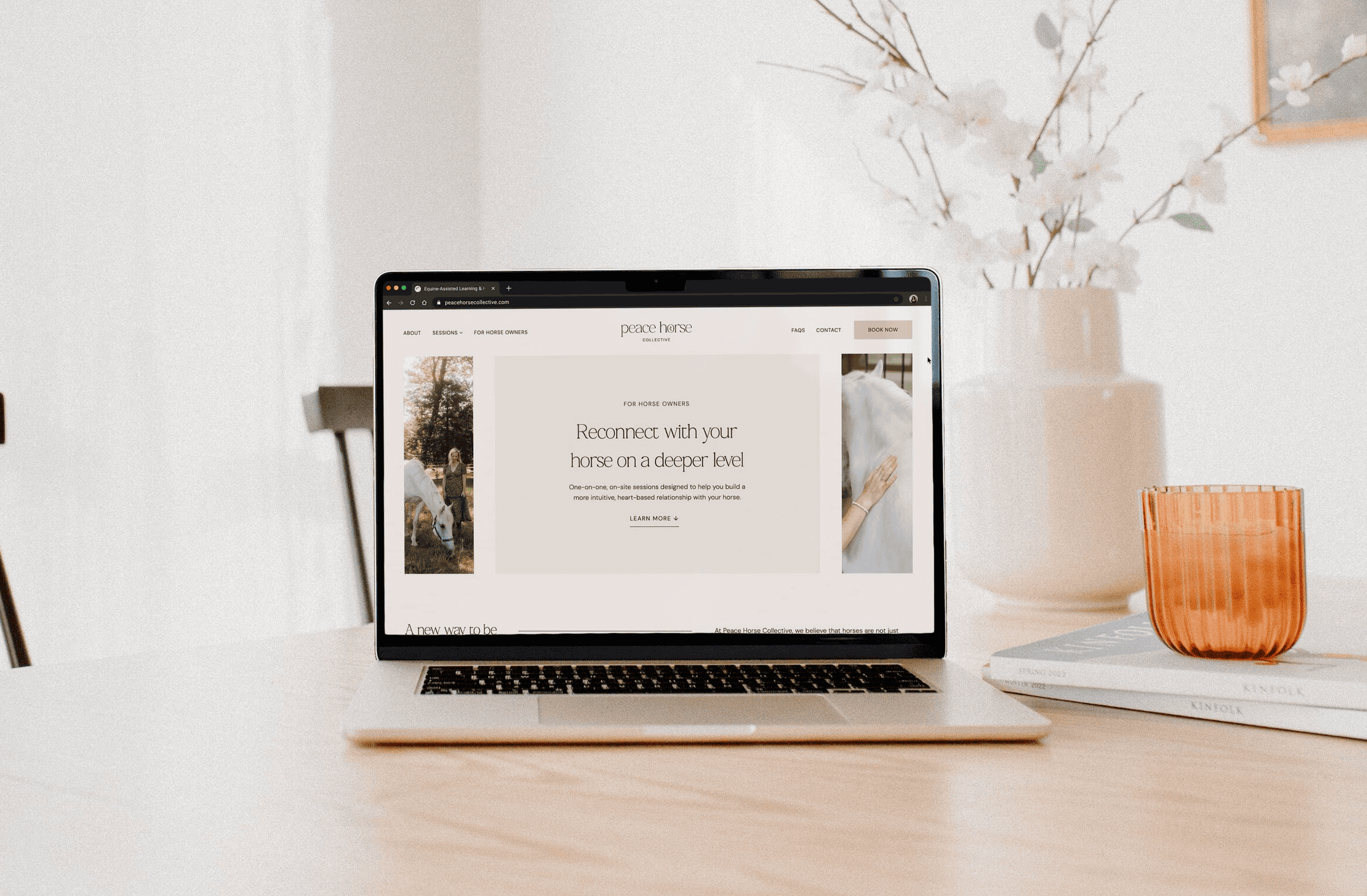
We built the site on Showit, which made it so simple to bring her vision to life while keeping the layout spacious, visual, and easy to understand.
👉 If you’re not familiar with Showit, you can try it here – it’s the platform I use for all my website designs!
Clarity as the foundation
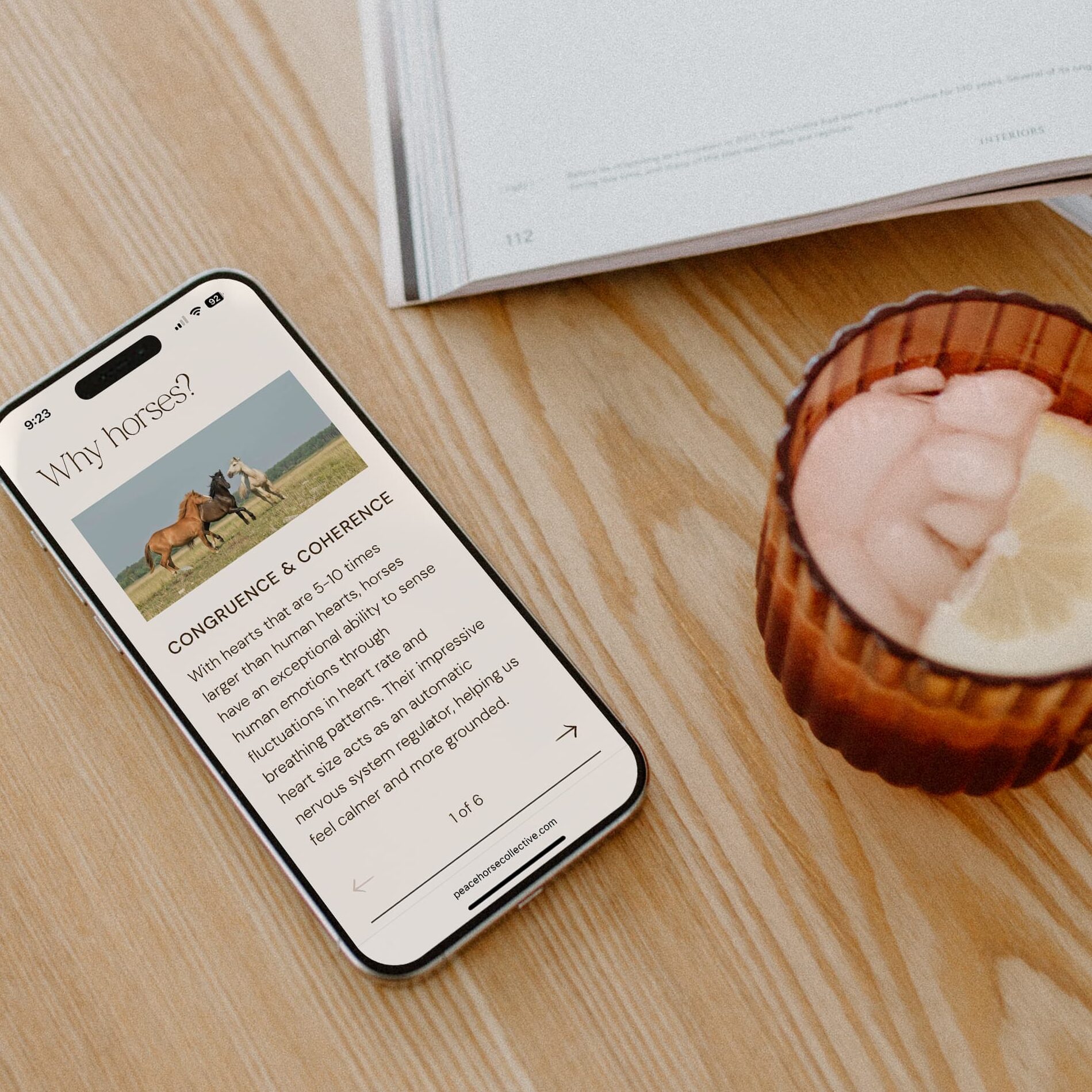
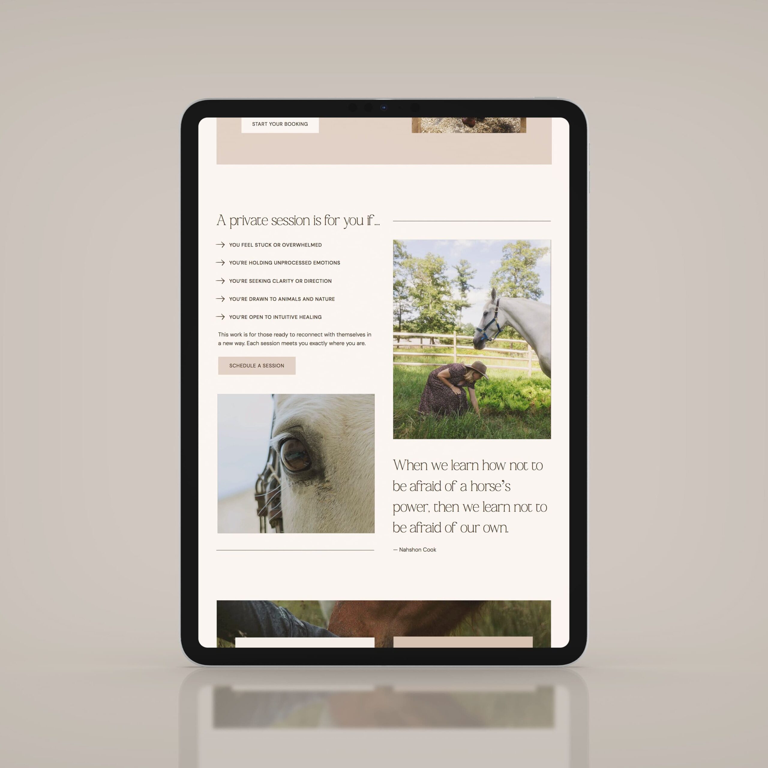
Because this work is unfamiliar for many people, we focused on making the information easy to take in. Clean layouts, short explanations, and straightforward pages help visitors understand the process quickly without feeling overwhelmed.
Space that feels like stillness
We used warm, soft neutrals and ample whitespace to bring the stillness of her in-person work into the design. This creates a calm visual rhythm that feels easy to move through and never overwhelming.
Imagery that honors the horses
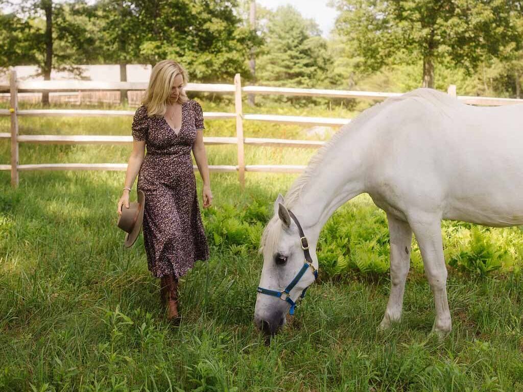
The photography was chosen to reflect the real nature of her horses – calm, observant, and present. We avoided cliché shots and used images that show their personality, dignity, and authenticity, which supports the heart of her brand.
A flow that feels safe and predictable
Navigation is simple, the pages are clearly identified, and each section has a clear purpose. This makes the experience feel steady and supportive, especially for visitors who may be exploring something new or seeking support during a challenging moment in their life.
Details that add subtle magic
We added a little bit of ‘magic’ through small, subtle choices like soft transitions, floral accents inspired by her vision exercise, and animated circular graphics throughout the site. I love these subtle circle animations because each circle has its own subtle variation, echoing the protective circle in her logo and reinforcing the idea that every person, every horse, and every session is unique. It’s a quiet little detail, but it helps the whole brand feel connected, thoughtful, and true to the work she does.
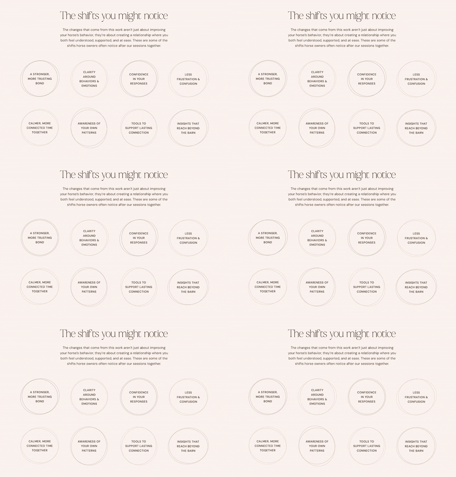
All of these design and content decisions worked together to create a beautiful website experience, while also giving search engines a clear, structured understanding of what Peace Horse Collective offers.
The Highlights
As the brand and website came together, a few pieces stood out as the elements that shaped the entire experience. These are the details that made Peace Horse Collective feel distinct and intentional, and made a key difference in her visibility and early search performance.
- Meaningful brand identity: A logo and wordmark with layered symbolism that communicates trust, peace, and healing, supported with typography chosen to feel soft, timeless, and aligned with the nature of her work
- Calm, intuitive flow: Warm, soft neutrals and generous whitespace create a steady, peaceful experience that mirrors the quiet environment of the sessions
- Clear, accessible guidance: Short sections like What to Expect, The Details, Who It’s For, and a dedicated FAQ page help visitors feel informed and supported as they learn about the work
- Honest, connected imagery: We focused on calm, natural moments with the horses so visitors can get a real sense of the experience, rather than forming assumptions from posed or clichéd visuals
- Supported user journey: Ultra-simple navigation, logical page structure, and clear CTAs help visitors know exactly where to go and what comes next
- Search-friendly structure: FAQ schema, clean headings, and clear question-based sections help answer visitors’ biggest questions while strengthening the site’s performance in Google search and AI Overview
👉 If you’d like to see more client stories like this one, you can browse them here.
The Results
Within just a few weeks of launching, the Peace Horse Collective website ranked #1 on Google and in the AI Overview for equine-assisted learning in her region – this usually takes months (sometimes even a year plus) for brand-new businesses! That quick traction came from clear messaging, focused pages, strong on-page SEO setup, and strategic elements like FAQ schema that make the site easy for both AI and search engines to understand.
Alongside the ranking, Leiko now has a brand and website she feels deeply aligned with and proud to share.
“The process far exceeded my expectations. Vickie is brilliant at taking your ideas and turning them into an elevated reality. She helped me create a brand/website that is professional, elegant, captivating and authentic to my vision. Best branding/website design experience I have ever had.”
Leiko, Founder of Peace Horse Collective
Want results like this for your own brand?
If you’re a wellness professional, practitioner, or coach ready to launch or refresh your online presence, I’d love to help bring your vision to life.
👉 Learn more about working with me here →
—
Note: Some links on this page are affiliate links, so I may earn a small commission if you purchase through them (at no extra cost to you). Sometimes, you’ll get a discount or special bonus for using them.

Vickie is the founder of VERVE & COLOR, a creative studio crafting elevated, intentional websites for health and wellness brands. She’s spent over a decade studying and practicing wellness—from holistic nutrition and meditation to sound therapy and somatic healing—alongside a career designing digital experiences for global companies. Today, she blends both worlds to create websites that are not only beautiful and easy to use, but rooted in the heart of the work her clients do.