
November 1, 2025
TL;DR:
This guide shows you how to turn website visitors into clients by fixing the basics first: writing a clear benefit-first headline, using one consistent CTA, placing proof where decisions happen, simplifying your layout, using branded photos, making your site fast and easy to use on mobile, keeping your message consistent, shortening your forms, and using your thank you page as an intentional next step. You’ll also find resources to help you choose better images and make your site calmer for neurodivergent visitors, plus a free Website Audit Checklist to spot what’s working and what’s missing.
Before you try to fix your website, read this
Let’s start with something most people miss → you can have the most beautiful website in the world, but if someone can’t tell exactly what it is that you do, who you help, or how to take the next step, they’re probably going to click away.
And that’s the last thing you want, right?
What you actually want is for them to stay, connect, and take that next step – what we call a conversion.
When people think about conversion, they often assume it means being “salesy”. But that’s not really it – conversion is about removing confusion so that visitors feel safe saying yes to whatever it is that you’re offering. And once you know that, fixing it gets a lot easier.
So let’s jump into 10 simple shifts you can make right now to boost your conversion and turn your visitors into clients who can’t wait to work with you.
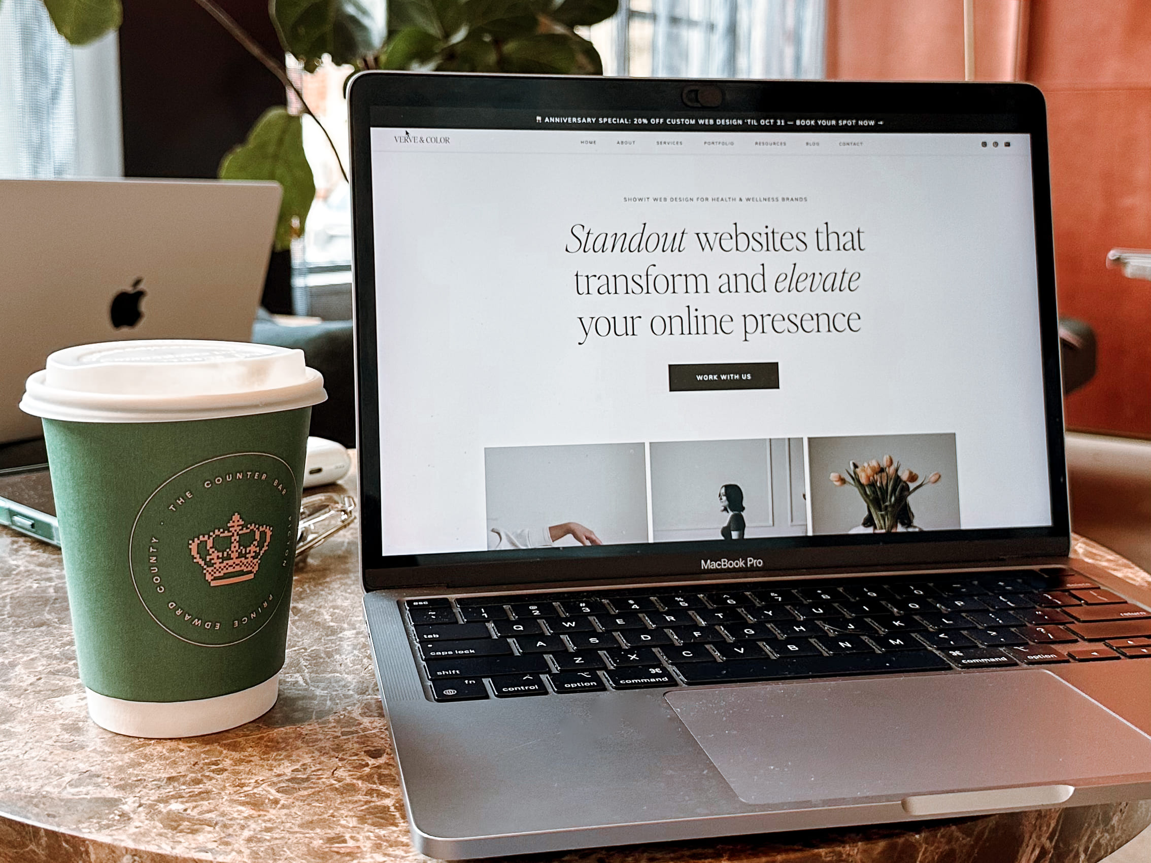
1. Lead with a clear, benefit-driven headline
When someone lands on your homepage, you have mere seconds 🤯 to tell them: who you help, what you help them do, and why it matters. That’s it.
Think about it this way: Imagine a new client walking into your studio or jumping on a call with you. You wouldn’t start with a 5-min story about your journey, right? You’d start by helping them understand what you do and how you can help. Your website should do the same.
If the first thing people see is a vague phrase like “Find your flow” or “Return to yourself”, they might love the vibe but still have no clue what you actually do.
What to do
Ditch the fluff and write something specific that your dream client instantly understands. One great way of doing this is by using this formula:
Helping [audience] [achieve result] through [method]
Example → Helping busy women release tension and improve posture in just 20 minutes of guided movement a day.
If your visitor can describe you in one sentence after 3 seconds, your headline is working.
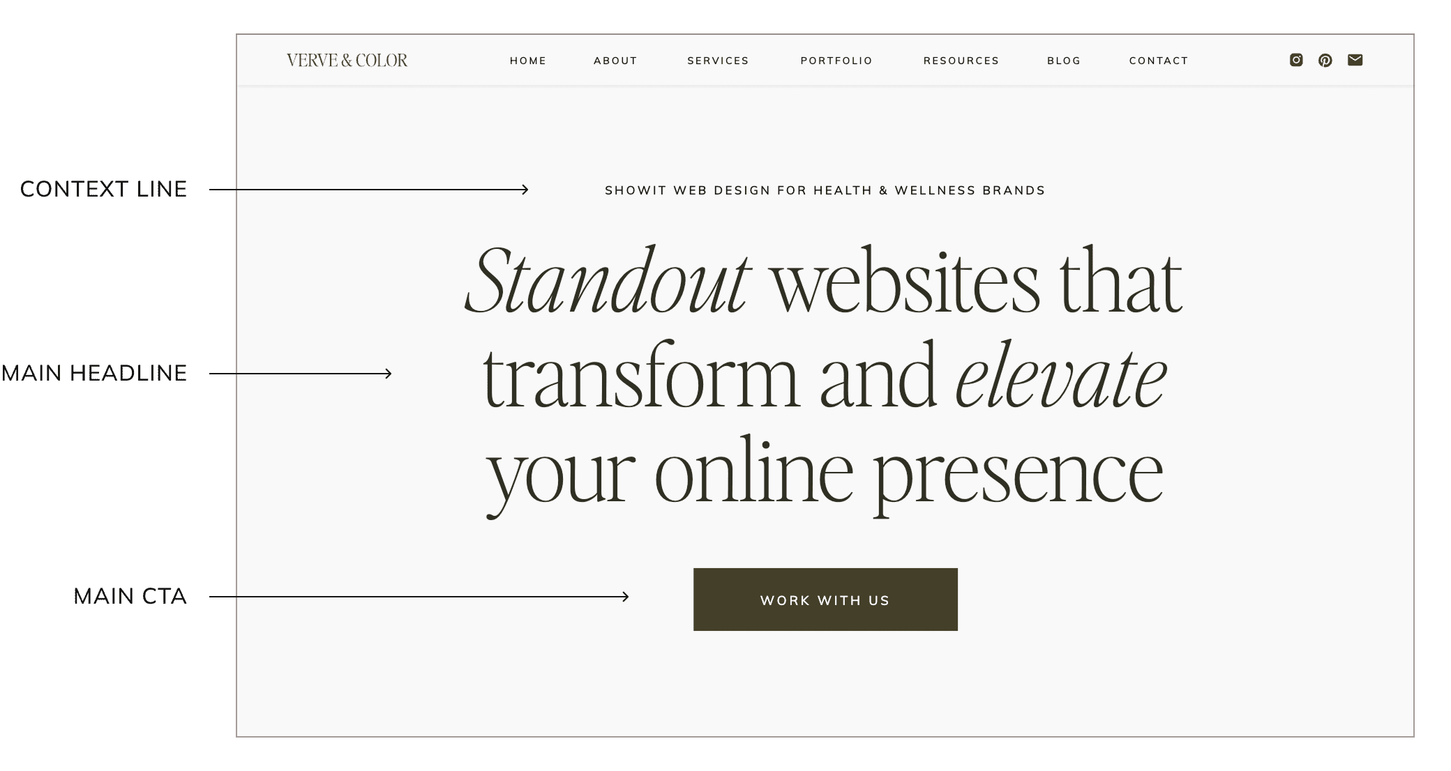
2. Make the next step obvious
You can have the perfect offer, but if your main button says “Learn more”, you’ve already lost momentum.
Every website needs a call-to-action (or CTA) – this is the button or phrase on your website that tells people what to do next, like “Book a session” or “Download your freebie”. It’s the bridge between someone being interested and actually taking action.
Going (which is a travel company) once changed three words – just three words(!!!) – in their CTA and saw a 104% jump in conversions. That’s how much clarity matters.
What to do
Pick one primary CTA and repeat it everywhere. Keep the color, text, and placement the same across your site.
Examples:
- Book a session
- Start your journey
- Work with me
If you’re using Showit, you can easily save your button styles (font, color, hover, everything) and apply it anywhere with one click – no coding or redesigning each time. It keeps your brand consistent and your site looking polished. 👌
(Oh, and if you’re new here – hi! I design elevated, intentional websites for health & wellness brands using Showit, a drag-and-drop platform that makes it ridiculously easy to customize your site without ever touching a single line of code! You can try it free here.)
3. Show proof early and often
Wellness is personal. Before anyone invests or books a session with you, they need to feel safe.
A beautiful site helps, but trust is what converts.
So how do you build that trust online? Start with the things that show you’re credible and experienced.
What to do
Scatter strong testimonials throughout your site, especially near your call-to-action buttons. Focus on results, not flattery.
“I finally sleep through the night after years of stress.”
“My digestion improved within 2 weeks of following her plan.”
Not: “she was great to work with”.
You want testimonials that highlight transformation – something tangible that potential clients can picture for themselves.
And don’t forget to use a proper testimonial release form so that you’re legally covered when sharing someone else’s story or results. This one is from my fave contract shop, The Contracts Market, and it’s free at the time of writing this.
Other ideas:
- Screenshot kind DMs or emails (with permission)
- Include client results (“sleeping through the night after 3 sessions”)
- Add small logos or certification badges for credibility
These quiet trust signals do more for conversions than any paragraph of copy ever could.
4. Simplify your layout to remove distractions
When people land on a page, they’re usually just looking for one thing – the next clear step.
But many sites pull people in too many directions with either too many links or unnecessary distractions.
Data shows the more links you have on a page, the lower your conversion rate actually is, because every extra link competes with your main goal. In other words, too many options = no action.
What to do
Keep your navigation simple (5 links is a good start). Give each page one clear goal (book, learn, subscribe, etc.).
When thinking about distractions, some common ones are busy backgrounds, too many buttons, text that’s hard to skim, or extra sections that pull focus away from your main offer.
For those in the wellness space, this matters even more. You’re trying to create a calm, grounded experience, right? You don’t want to overwhelm people. So a clean, uncluttered layout helps your visitors feel relaxed, confident, and clear about what to do next.
If you want to take this a step further, especially for clients with ADHD, autism, or sensory sensitivities, check out this guide on creating a neurodivergent-friendly website. Just a few small shifts can make a big difference.
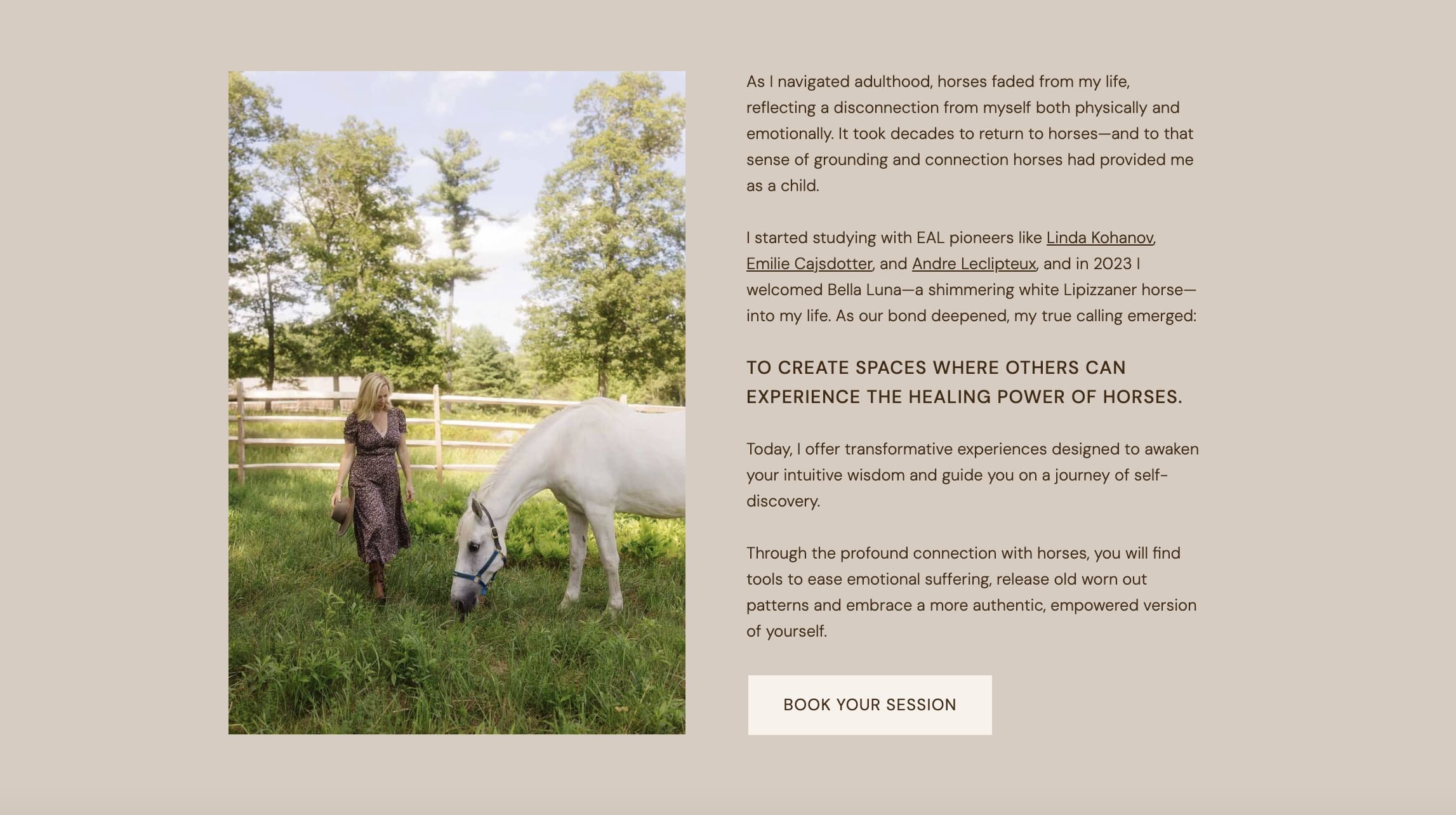
5. Use branded photos of you
Photos are usually the first thing people notice on your website. Before they read a single word, they’re already deciding if you feel real, relatable, and trustworthy.
And when people see you (and/or genuine moments from your work), it creates an instant sense of connection and trust.
So having professional brand photos is important. But if you don’t have any yet, no stress. You can still create a cohesive, elevated look using stock imagery – the trick is choosing photos intentionally. I share all about where to find free professional images for your website here. It walks you through how to choose stock that actually matches your brand’s vibe.
What to do
Use branded photos of yourself. Include lifestyle moments and avoid stiff, over-posed stock images.
When you’re selecting photos for your site, try placing shots where you’re looking in the direction of your headline or button – this subtly guides the viewer’s eyes right where you want them. 😉
When it comes to lifestyle moments, think about showing the feeling behind your work: food prep, grounding, movement, quiet spaces, natural light – anything that reflects your energy and process.
Stock can still work beautifully for close-ups or background details (think ingredients, textures, tools), as long as the tone, colors, and mood align with your brand.
The goal is to help visitors feel what it’s like to work with you.
6. Make mobile effortless
Every year, more and more people are using their phones to browse the web, and according to Google, people will leave your site if it takes longer than 3 seconds to load.
What to do:
Focus on your mobile site. Don’t assume it adjusts automatically from your desktop version. Keep sentences short, text at least 16px, and buttons full-width so they’re easy to tap.
Test your font sizes (always start at 16px and go up from there). No one should need to zoom in just to read.
Also, if you have a booking form, test it on your own phone. It shouldn’t take more than a minute to complete.
7. Keep your site running smoothly
Slow pages annoy people… and they also make you look less credible. So much so that nearly 8 in 10 people who experience a slow site say they won’t return to buy again. Yikes.
What to do:
Compress all your images before uploading. Avoid heavy background videos. Limit extra plugins and embedded widgets that slow down your site.
To compress your images, you can use a tool like ILoveIMG. It’s literally just upload → compress → done. Just give them a quick check after to make sure the color and sharpness still look good.
Showit already handles a lot of optimization behind the scenes (another reason why I love it!), but it’s always good practice to compress your images anyway.
8. Match your message everywhere
Your messaging should be consistent wherever people find you – your website, your socials, email, all of it. When your message shifts from one place to another, people start to lose trust.
Let’s say your Instagram bio says you help women find calm through breathwork, but your website headline talks about embodied mindfulness. Same(ish) idea, different words… To someone new, this can feel like 2 different brands. And that tiny disconnect can be all it takes for them to hesitate and wonder if they’re in the right place.
What to do:
Use the same language, tone, and offer names everywhere.
If you call your 1:1 package “The Renewed Method” on your socials, your website should say the same thing.
The goal is for someone to feel like every touchpoint belongs to the same, seamless experience. The words, tone, and visuals should always feel like one continuous conversation.
9. Simplify your forms
Back in 2011, Expedia removed a single unnecessary field from their checkout form and made an extra $12 million in profit. Wild!
I feel like that pretty much says it all.
What to do
Keep your form short.
Name, email, and message. That’s it.
Less work for them, more bookings for you.
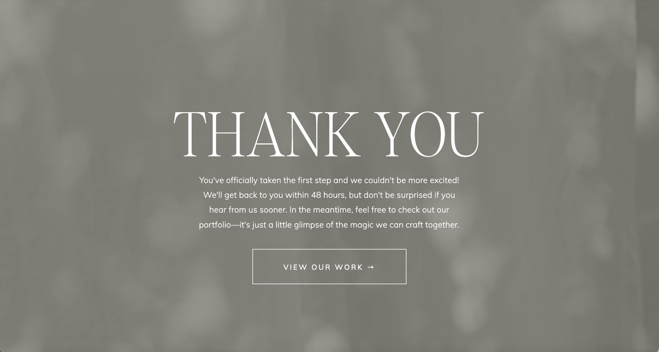
10. Don’t waste your thank-you page
Say someone just booked with you or downloaded your freebie – they’re now at their most engaged moment. Don’t end the experience with a dead-end “thanks”.
What to do:
Turn your thank-you page into the next step in your funnel.
- Share a short video that thanks them personally.
- Offer a next step (“while you wait, read this guide…”)
- Share a free resource or helpful blog post
- Invite them to connect on Instagram or join your list
This is such an easy trust-building opportunity for you! It keeps momentum going and helps new leads feel connected before they even meet you.
The main takeaway
You don’t need fancy funnels or paid ads to turn visitors into clients. But you do need clarity, trust, and small tweaks that make your website easier to navigate and safer to say “yes” to.
Start with just one change – #1 or #2 is a great place to start. Those alone can make a real difference in your sales.
I’d also recommend grabbing The Essential Website Audit Checklist. It’s a simple guide that helps you spot what’s working, what’s not, and what might be missing – so your website can actually do its job and convert.
And if you’ve checked all those boxes and things still feel quiet, then it’s time to talk about visibility. Because if your website is solid but no one’s finding it… that’s a whole different story.
Check out this post on how to grow your audience in 2026 – it’ll help you get more eyes (and aligned clients) on your work. Good luck 🤎
—
Note: Some links on this page are affiliate links, so I may earn a small commission if you purchase through them (at no extra cost to you). Sometimes, you’ll get a discount or special bonus for using them.

Vickie is the founder of VERVE & COLOR, a creative studio crafting elevated, intentional websites for health and wellness brands. She’s spent over a decade studying and practicing wellness—from holistic nutrition and meditation to sound therapy and somatic healing—alongside a career designing digital experiences for global companies. Today, she blends both worlds to create websites that are not only beautiful and easy to use, but rooted in the heart of the work her clients do.
